While looking for ideas on how to visualize my time-tracking data, I was surprised—pleasantly surprised—to see that many others (and I mean many) have attempted similar visualizations. One of the them was a post by Chris Riederer replicating “the most beautiful visualization of all time” by Wesley Elliott, who visualized his daughter’s sleep patterns.
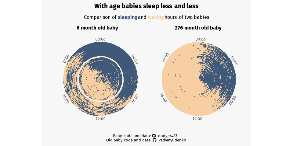
A visualization represents six months of sleep and wakefulness of a baby and contrasts it with a little over a year worth of sleep and suffering of a much older baby (yours truly). The spiral begins at the interior of the circle, marking the start of life for a baby. For the older baby, the spiral marks the beginning of studying, deadlines, and the slow demise of a healthy sleep schedule. The spiral then wraps outward as babies gets older — each full revolution of the circle represents one 24-hour day, meaning that midnight is at the top of the “clock” and noon is at the bottom.